Styles
Here are thirteen styles to choose a starting point from. Each one shows the same page: view it on desktop or on a phone and try it live.
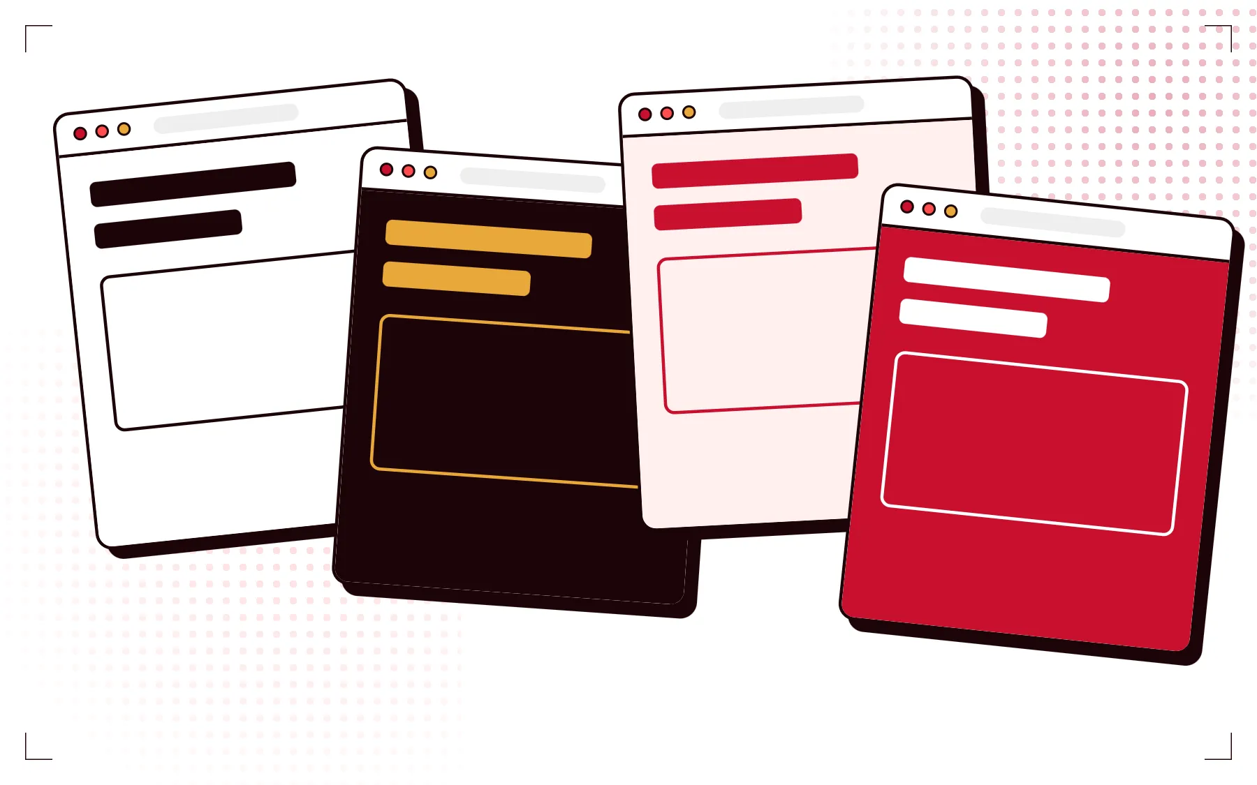
Color proof
White paper and printing inks. The headline starts out of register and settles.


Blueprint
Blue technical drawing with a drifting grid, a decoding headline and measurement marks.


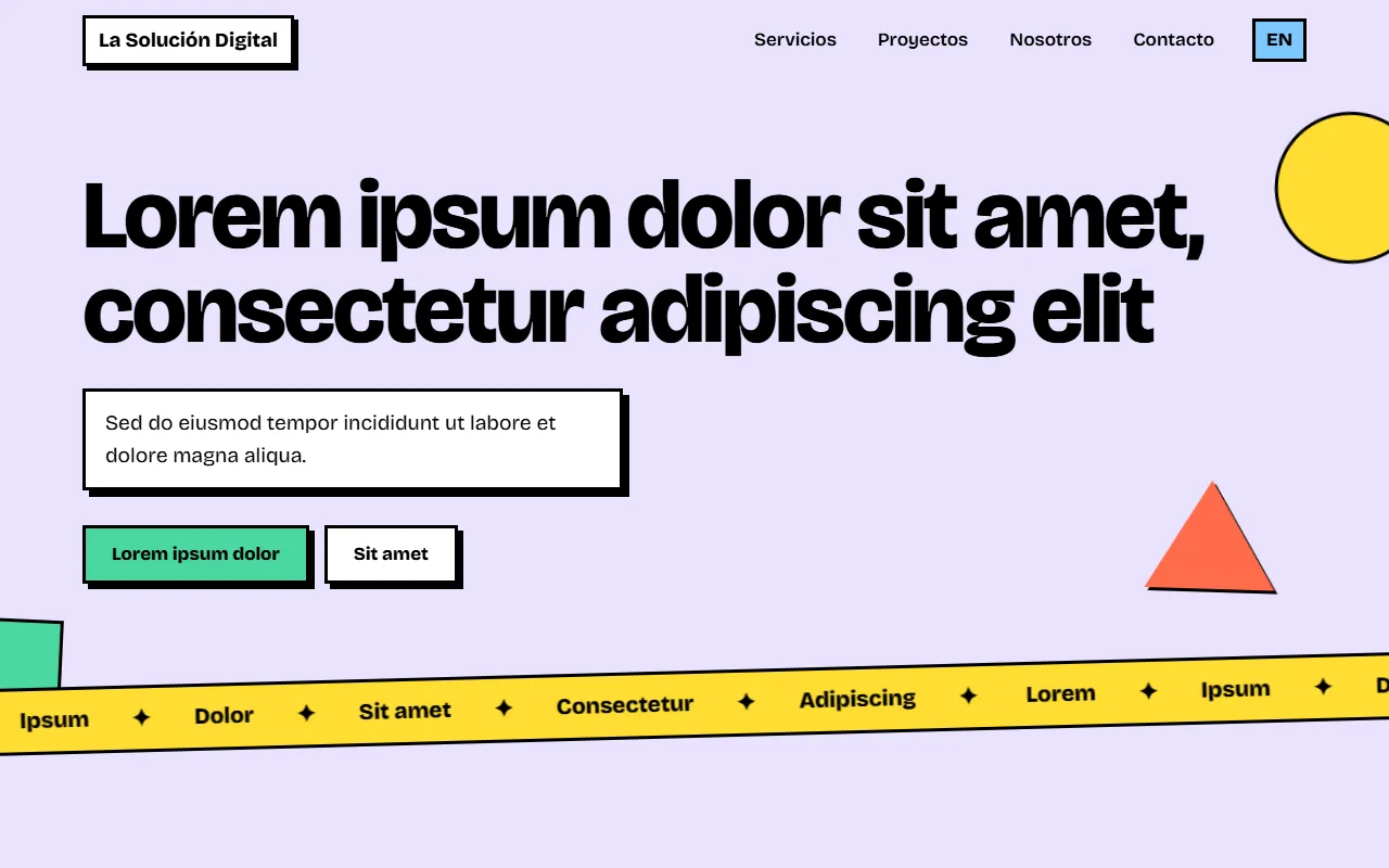
Blocks
Neobrutalism: thick borders, hard shadows, flat colors and buttons that press down.

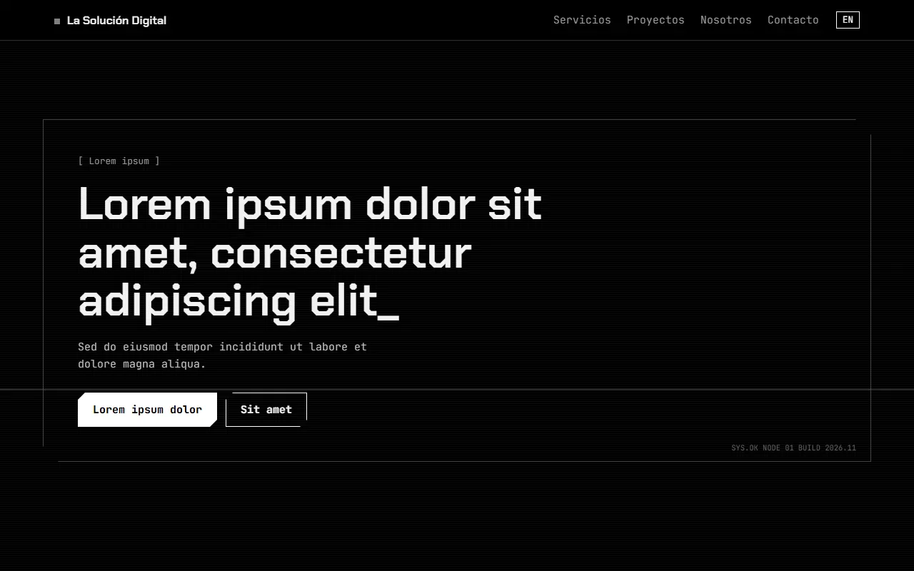
HUD interface
Black and white sci-fi screen: cut-corner frames, self-typing text and live readouts.

Editorial
Magazine-like: large serif, uneven columns, small metadata and images that invert.


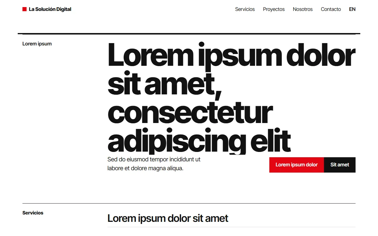
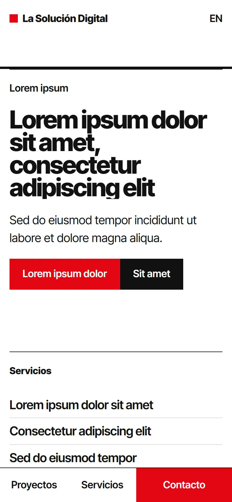
Swiss
Strict grid, plain type and a single red. Rules draw in as you scroll.
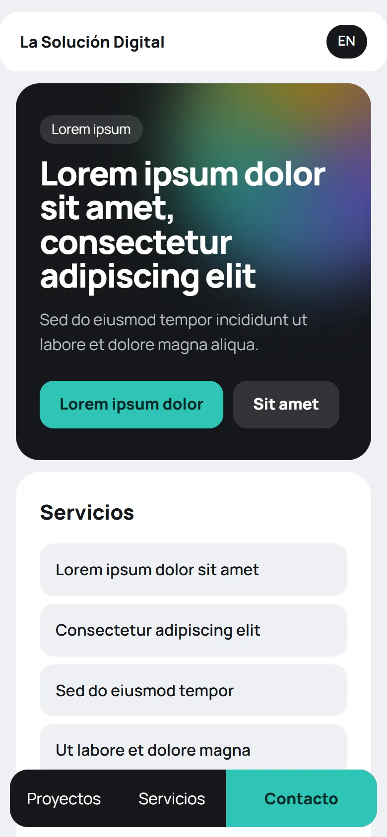
Bento
Everything sits in rounded tiles of different sizes, like a bento box, so the page reads at a glance.

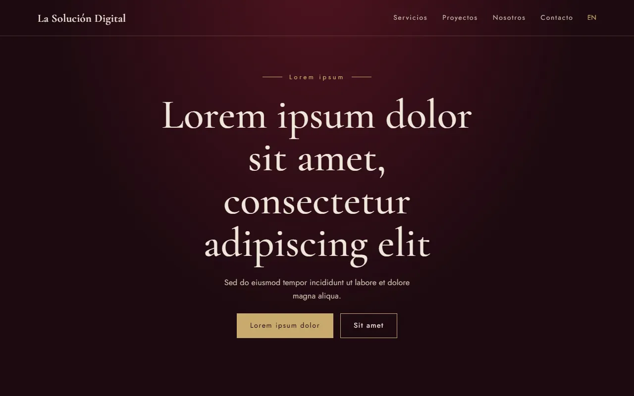
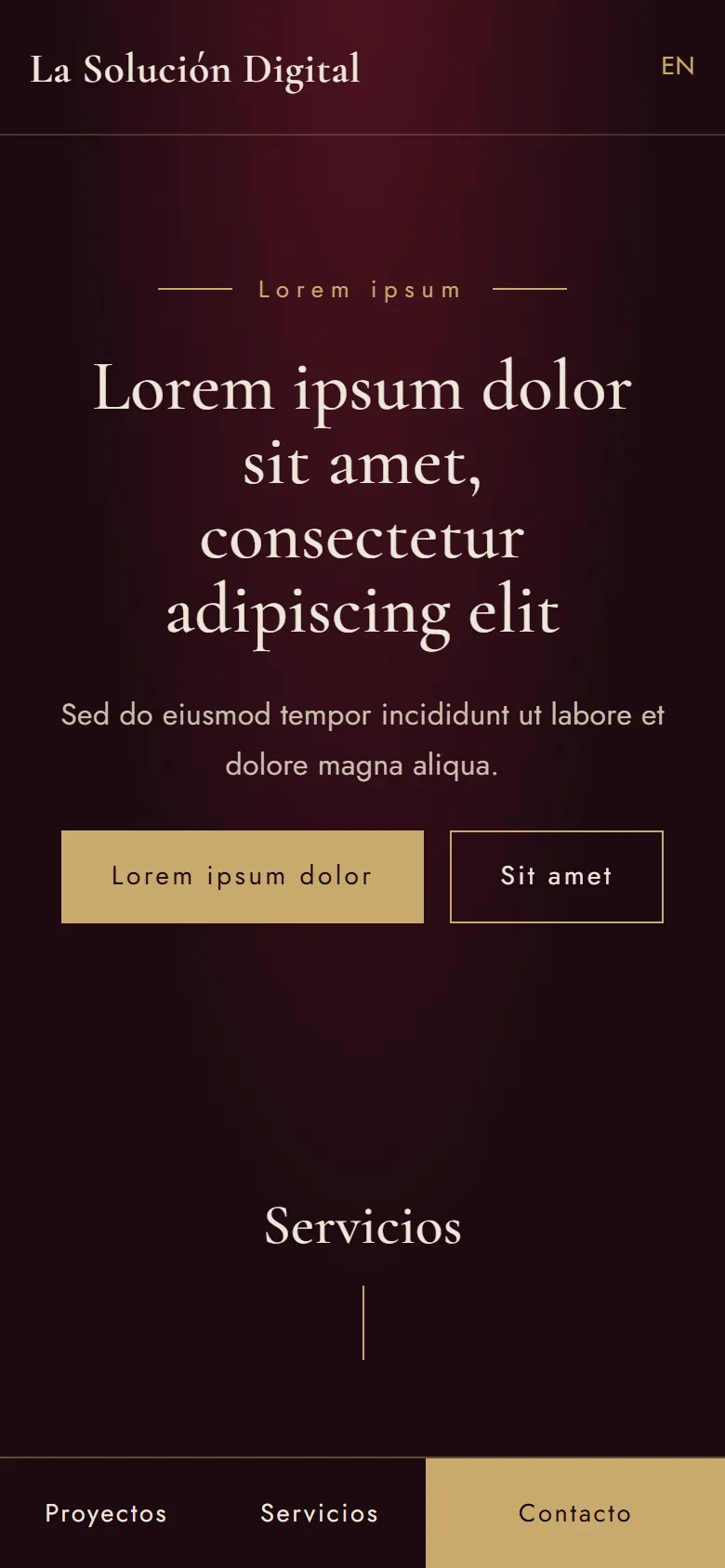
Cellar
Dark and elegant, made for wine and premium products: fine serif, muted gold and revealing photos.
Aurora
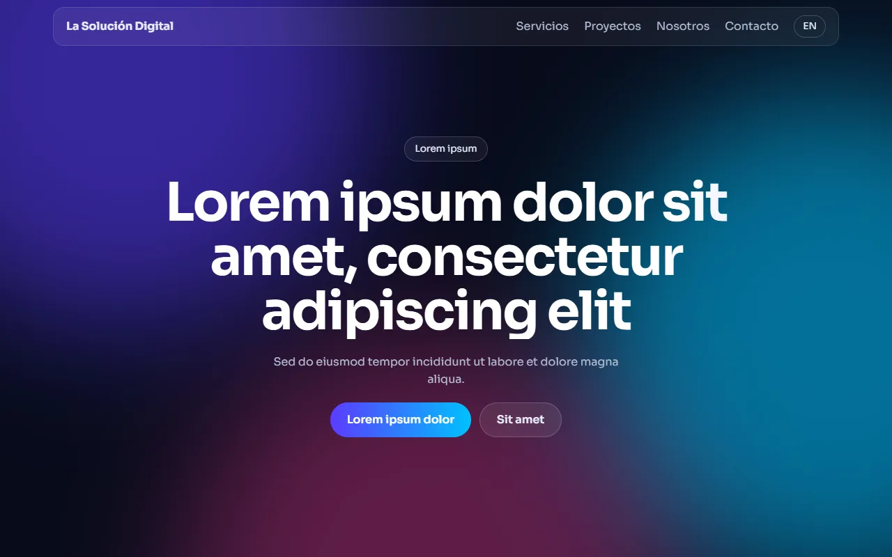
Dark background with moving color lights and glass cards, the usual look of apps and startups.

Organic
Soft shapes that change outline over light greens and earth tones. It suits natural or wellness brands.


Kinetic
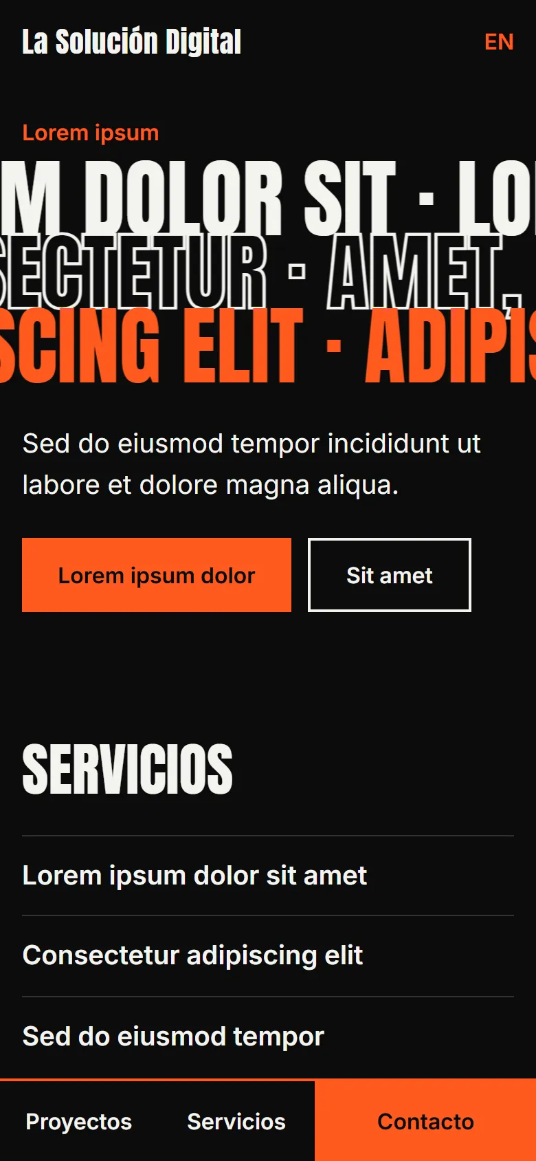
Giant type moving across black. It works for campaigns and brands that want to get noticed.

Collage
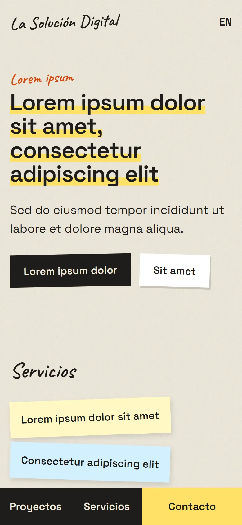
Paper, tape and hand-pasted photos, with handwritten notes.

Retro 95
Nineties computer windows, raised buttons and pixel type, for brands that want to play with nostalgia.

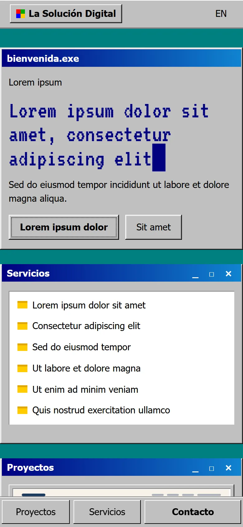
Each style adapts to your brand. On the same base I change the colors, the typefaces and the content.